
Hello, dear web explorer! 🕵️♀️💻
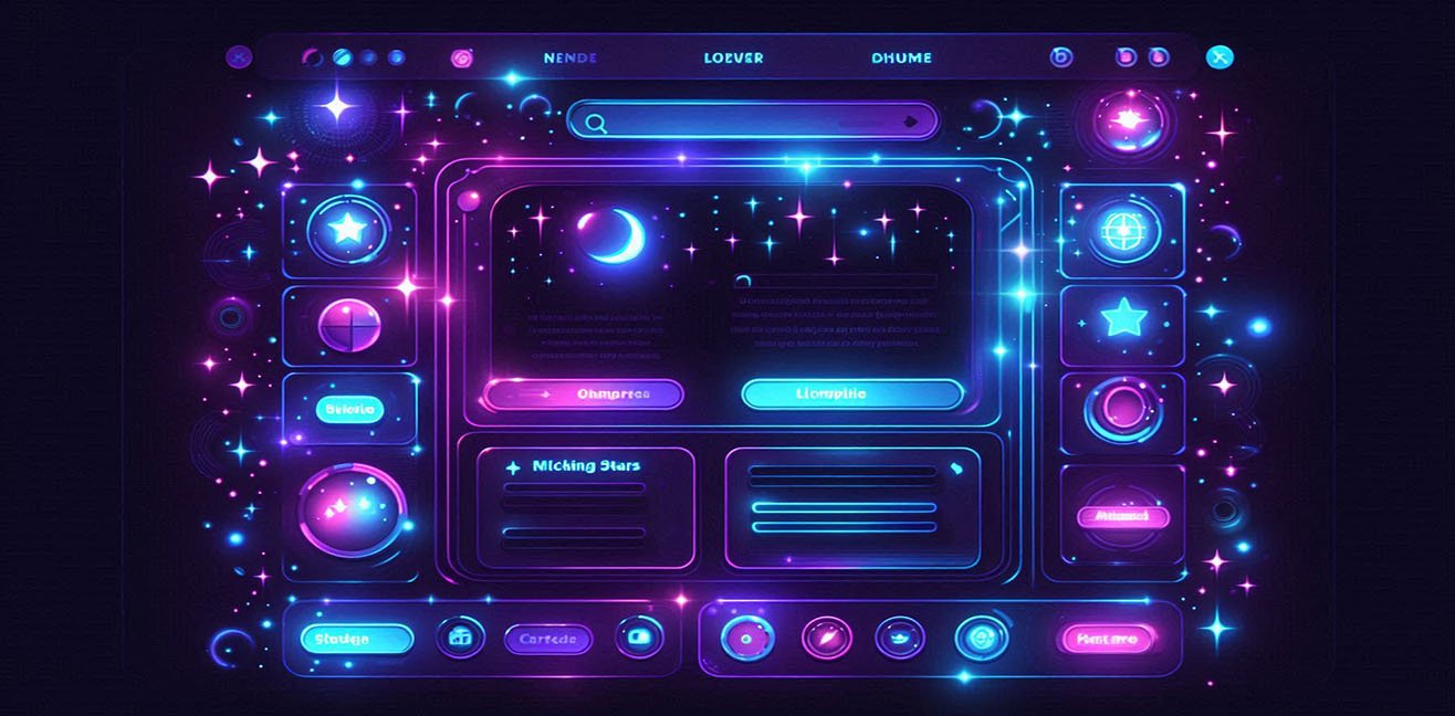
Dark mode not only protects the eyes; it transforms your webpage into a space adventure. Stars, neon lights, smooth transitions… When combined, visitors will want to get lost on your site! 🌙✨
In this guide, my love, I prepared a night mode experience full of detailed code examples, practical tips, and fun ideas. 🎉
1️⃣ What is Dark Mode? Why is it Important? 🌑
Dark mode is a design approach where the page background is darkened and text is shown in light tones. But be careful, my love, it’s not just a simple black background! 😎
Why Use It?
- Eye health: It prevents eye strain in low-light or nighttime conditions. 👀
- Battery saving: Dark backgrounds save energy on OLED screens. 🔋
- Modern look: With neon, galaxy, and animation effects, your site can feel like a spaceship control panel! 🚀
💡 Unconventional tip: Automatically enable dark mode based on the user’s time, adding an extra magical touch to your site.
2️⃣ Basic Dark Mode CSS – First Step 🌙
Let’s create a basic dark mode. This CSS will set colors and smooth transitions:
/* General Body */
body {
  background-color: #121212;  /* Dark background */
  color: #e0e0e0;             /* Light text */
  font-family: 'Arial', sans-serif;
  transition: all 0.5s ease;  /* Smooth transition */
}

/* Links */
a {
  color: #bb86fc;             /* Neon purple links */
  text-decoration: none;
  transition: color 0.3s;
}

a:hover {
  color: #03dac5;             /* Neon turquoise on hover */
}

/* Buttons */
button {
  background-color: #1f1f1f;
  color: #e0e0e0;
  border: 2px solid #bb86fc;
  padding: 10px 20px;
  cursor: pointer;
  border-radius: 10px;
  font-weight: bold;
  transition: all 0.3s;
}

button:hover {
  background-color: #bb86fc;
  color: #121212;
  transform: scale(1.05);      /* Slight growth on hover */
}
💡 Tip: Using transition and transform makes interactions feel like objects floating in space.
3️⃣ Night Mode Toggle Button – User Control 🕹️
Let’s create a toggle button so users can turn dark mode on and off:
<button id="darkModeToggle">Toggle Night Mode 🌙</button>

<script>
const toggle = document.getElementById('darkModeToggle');
toggle.addEventListener('click', () => {
  document.body.classList.toggle('dark-mode');
});
</script>
CSS:
.dark-mode {
  background-color: #121212;
  color: #e0e0e0;
}

.dark-mode a {
  color: #bb86fc;
}

.dark-mode button {
  background-color: #1f1f1f;
  color: #e0e0e0;
  border-color: #bb86fc;
}
💡 Fun idea: Add a tiny star explosion animation when clicking the button! 🌠✨
4️⃣ Starry Background – Let the Space Adventure Begin! 🌌
Make dark mode more exciting by adding a CSS starry galaxy:
<div class="stars"></div>
CSS:
.stars {
  width: 100%;
  height: 100vh;
  position: fixed;
  top: 0;
  left: 0;
  z-index: -1;
  background: transparent;
  box-shadow:
    50px 100px #fff,
    150px 200px #fff,
    300px 400px #fff,
    500px 100px #fff,
    700px 250px #fff;
  animation: twinkle 5s infinite;
}

@keyframes twinkle {
  0%, 100% { opacity: 0.8; }
  50% { opacity: 0.3; }
}
💡 Practical tip: Add hundreds of stars in box-shadow to make the galaxy denser.
5️⃣ Neon Text – Spaceship Control Panel 🌠
Neon colors give headings and text a spaceship vibe:
h1, h2 {
  color: #03dac5; /* Neon turquoise */
  text-shadow:
    0 0 5px #03dac5,
    0 0 10px #03dac5,
    0 0 20px #03dac5,
    0 0 40px #bb86fc;
  transition: 0.3s;
}

h1:hover, h2:hover {
  color: #bb86fc;
  text-shadow: 0 0 10px #bb86fc, 0 0 20px #03dac5, 0 0 30px #03dac5;
}
💡 Fun idea: Hover effects can make headings look like trembling holograms.
6️⃣ Automatic Night Mode – Use the Power of Time ⏳
Activate dark mode based on the visitor’s hour:
const hour = new Date().getHours();
if(hour >= 18 || hour <= 6) {
  document.body.classList.add('dark-mode');
}
💡 Unconventional tip: Make stars disappear at sunrise for an even more magical effect. 🌅
7️⃣ Animated Stars – More Interaction 🌠
CSS for shooting star effect:
.star {
  position: absolute;
  width: 2px;
  height: 2px;
  background: #fff;
  border-radius: 50%;
  animation: shoot 2s linear infinite;
}

@keyframes shoot {
  0% { transform: translateY(0) translateX(0); opacity: 1; }
  100% { transform: translateY(100vh) translateX(50vw); opacity: 0; }
}
💡 Practical tip: Use JavaScript to create random stars and trigger meteor showers on clicks. 🌌
8️⃣ Bonus: Fully Interactive Night Mode Form 🪄
Forms can also match dark mode and be interactive:
<form>
  <input type="text" placeholder="Your Name? 🌙" required>
  <input type="email" placeholder="Your Email ✨" required>
  <button type="submit">Submit 🚀</button>
</form>
CSS:
form input {
  background-color: #1f1f1f;
  color: #e0e0e0;
  border: 1px solid #03dac5;
  padding: 10px;
  margin: 5px 0;
  border-radius: 5px;
  transition: 0.3s;
}

form input:focus {
  border-color: #bb86fc;
  box-shadow: 0 0 10px #bb86fc;
}

form button {
  background-color: #03dac5;
  color: #121212;
  border: none;
  padding: 10px 20px;
  cursor: pointer;
  border-radius: 10px;
  font-weight: bold;
}

form button:hover {
  background-color: #bb86fc;
  color: #e0e0e0;
}
💡 Unconventional tip: Add starburst animations on hover or click to make the form feel like a fun space shuttle. 🚀✨
🔮 Conclusion
See😎
Dark mode isn’t just about eye protection; it offers an interactive, neon-lit, starry space-themed web experience. Users will feel like tiny astronauts while browsing your site! 🌌🌙🚀
💡 Mini Challenge: Next step: add meteor showers, animated neon buttons, and hover-effected headings with JavaScript. Your page will become a full-fledged space adventure! 🌠✨